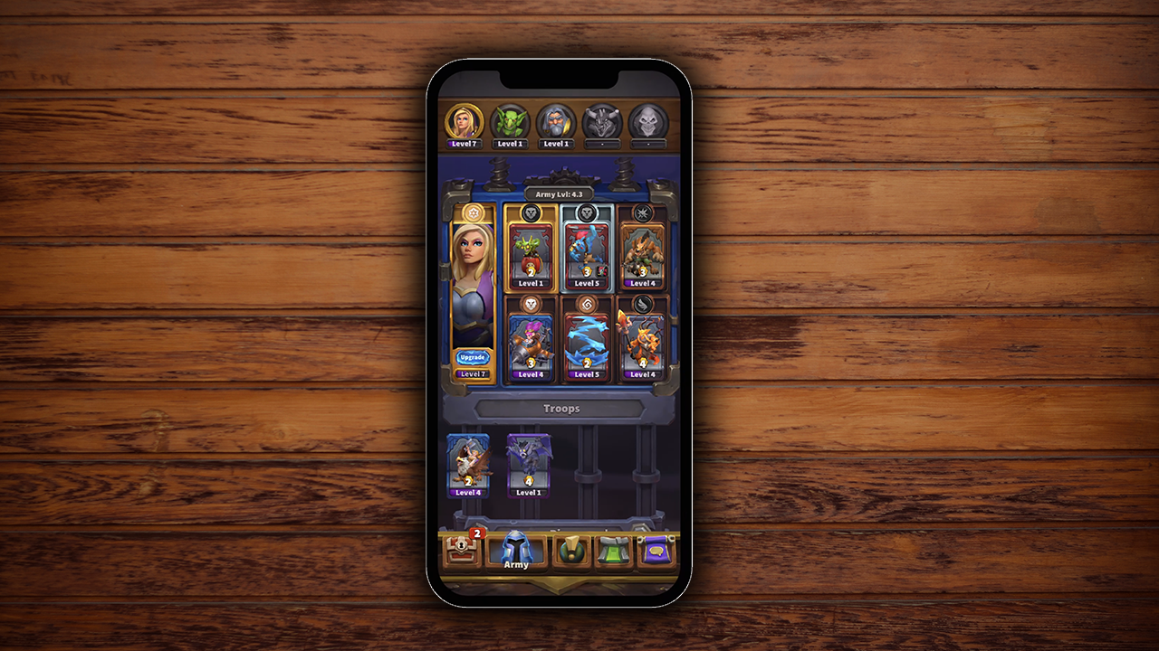
Army management buried deep in a broken hierarchy
Warcraft Rumble is a mobile action strategy game by Blizzard Entertainment set within the Warcraft universe - collectible Minis battle in frantic melee skirmishes, each controlled by an Army Leader. Blizzard wanted to improve the Army Leader selection process to help players manage their armies seamlessly.
My responsibility was to redesign the end-to-end experience of this process - not just fix surface-level issues, but understand the mental model breakdown and restructure it.
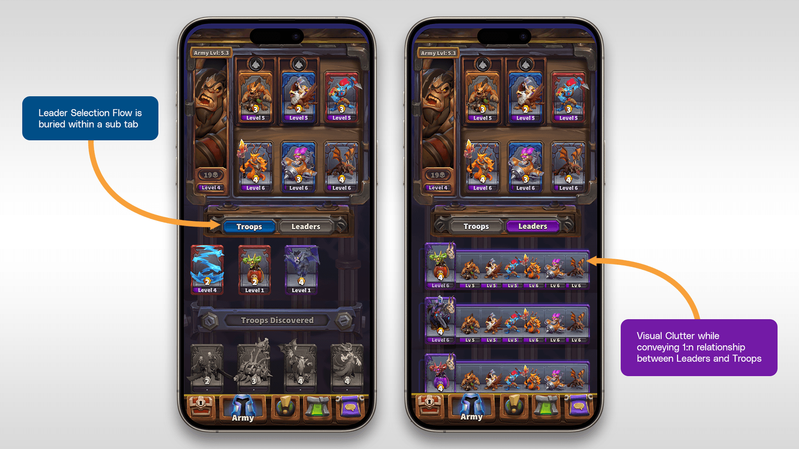
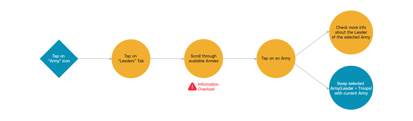
Information about all Armies owned by the player was buried within the Leader tab - players had to navigate away from their current context to switch leaders.
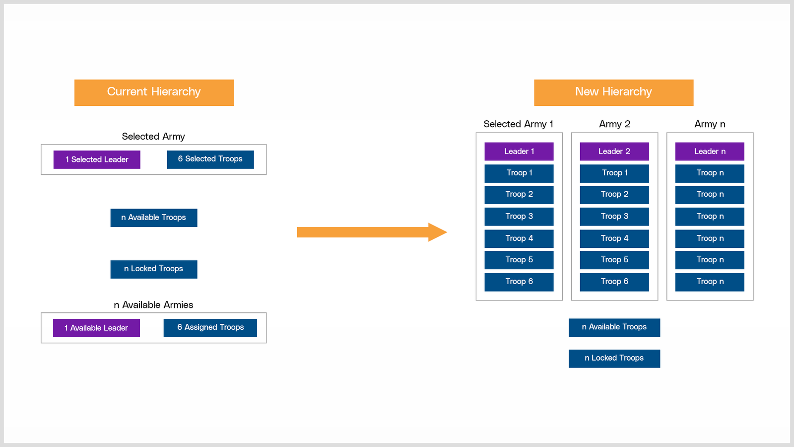
Players found it hard to understand that each Leader controls 6 Troops - and that the same troops can be assigned to different Leaders. The visual design didn't communicate this hierarchy at all.
Planned cosmetics (Tower skins, miners, emotes) shared a 1:1 relationship with each Leader, but the existing architecture had no space for this - meaning a full redesign was coming anyway.
Mapping the hierarchy breakdown
Making the Leader-Troop hierarchy visible at all times was the central insight. If Leaders were always visible on screen, they would establish themselves as the entry point into a player's army - and naturally communicate the relationship between a Leader and their Troops below.
This structural change would also work positively for the planned future cosmetic additions, which were tied 1:1 to each Leader. Solving the hierarchy problem solved the cosmetics problem simultaneously.
Three solutions tested with real users
Post-brainstorming, 3 potential solutions were explored and tested with potential users through digital wireframes.
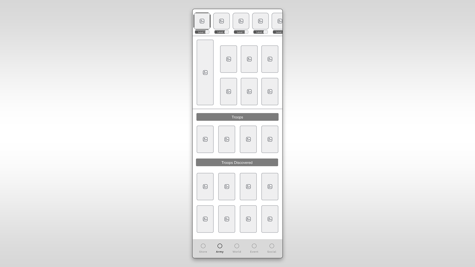
- Places Leaders in a prominent position, establishing clear visual hierarchy
- Adheres to common design conventions, reducing learning curve
- Reinforces Leader-Troop association intuitively
- May reduce available screen real estate for Troops below
- Fixed widget could feel rigid on smaller device sizes
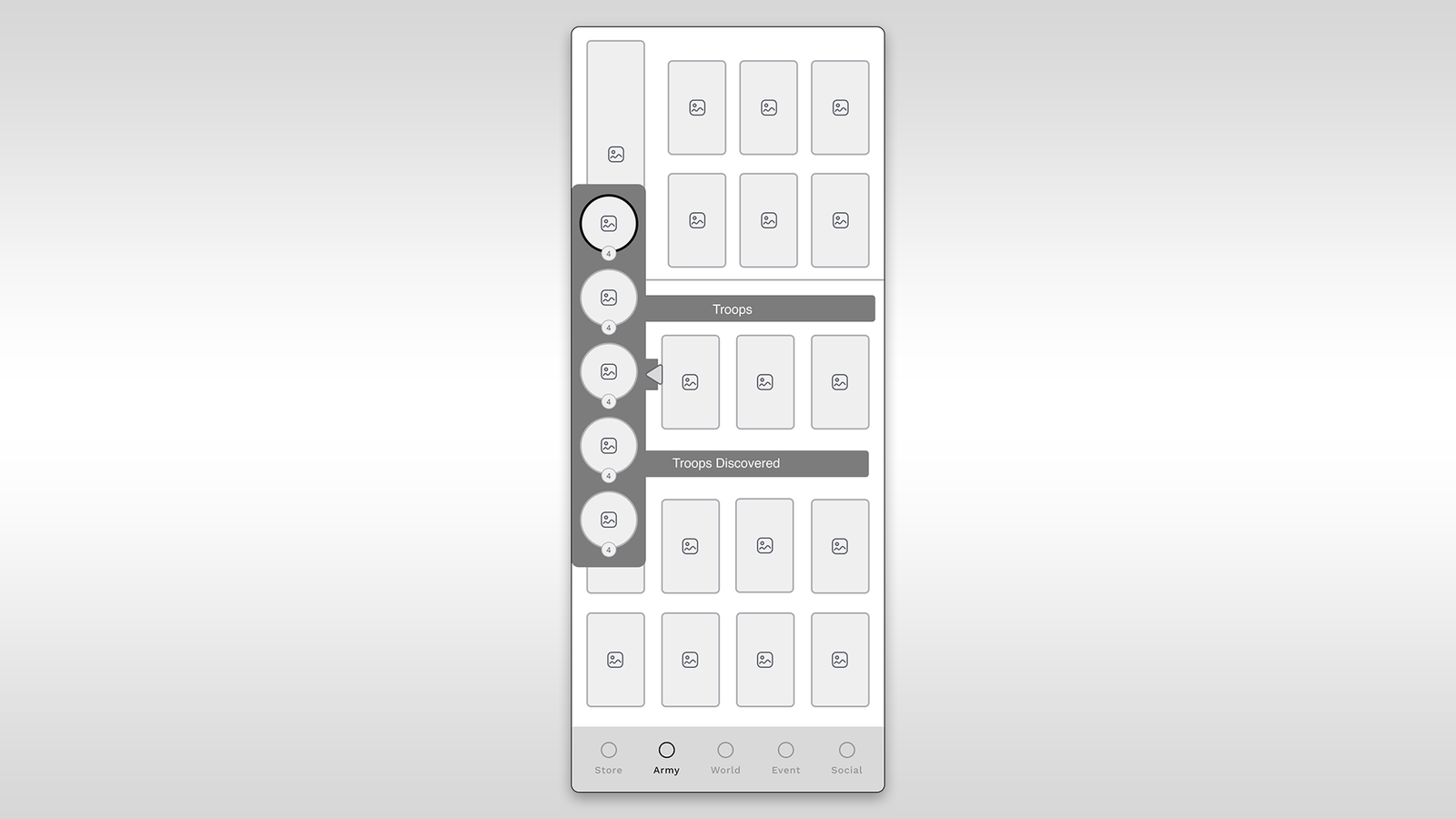
- Maximizes screen real estate when panel is collapsed
- Gives power users more control over their viewport
- Users might overlook Leaders if the panel is collapsed
- Expandable panel concept may be unfamiliar, adding a learning curve
- Adds design and development complexity
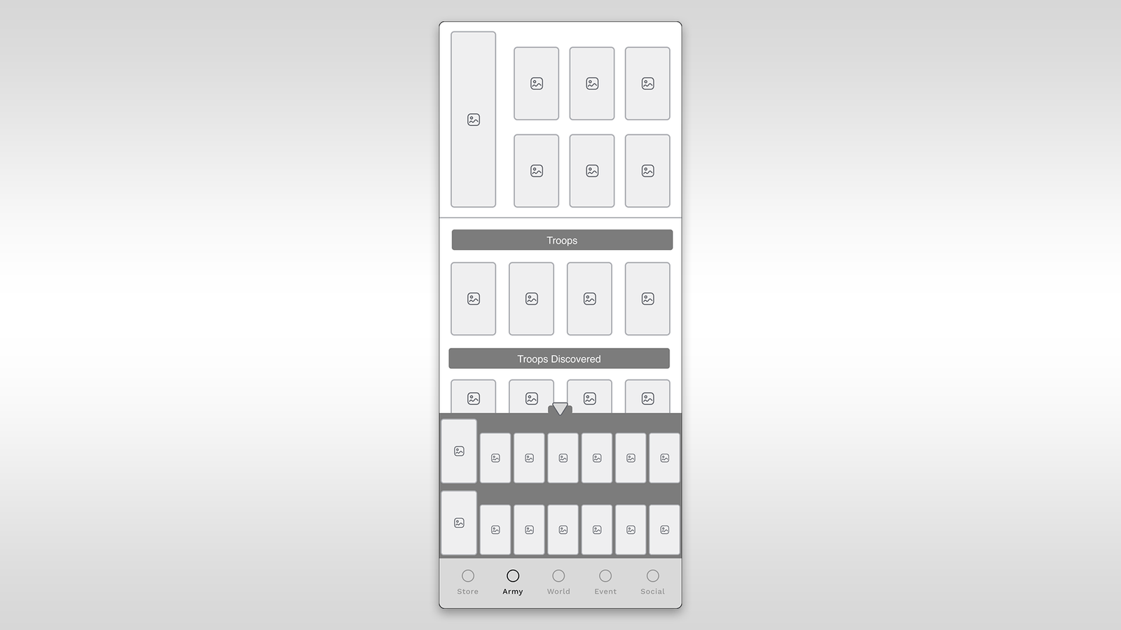
- Maintains consistency with the current design
- Thumb accessibility on mobile devices
- Familiar to existing players
- Reduces visibility of Leaders - players may miss them
- Fails to solve the hierarchy clarity problem
Fixed widget at top - always visible, always the entry point
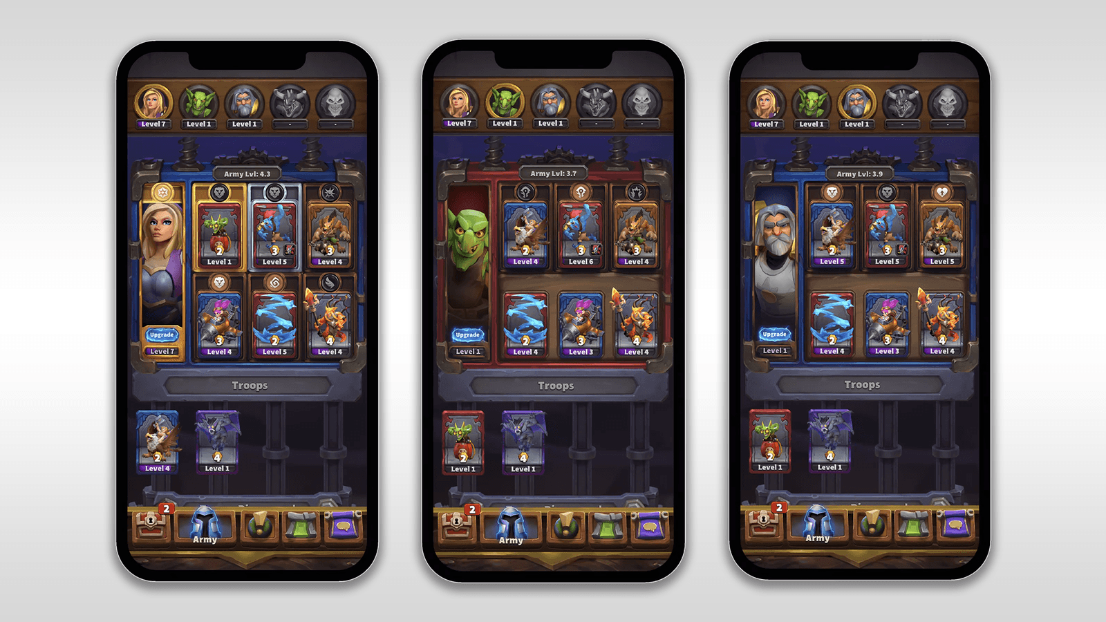
Option 1 was selected: a fixed Leaders widget at the top of the Army screen, ensuring constant visibility and establishing Leaders as the primary navigation hub. The solution included several supporting design decisions:
Removed the Leader sub-navigation button next to the Troops button for a cleaner interface - one less tap to achieve the same goal.
New sections for Tower skins, miners, and emotes appear only when the player unlocks cosmetics - progressively revealing depth as players advance.
Cosmetics are tied to each Leader individually, allowing distinct customization per army - making the visual system scale with the game's content roadmap.
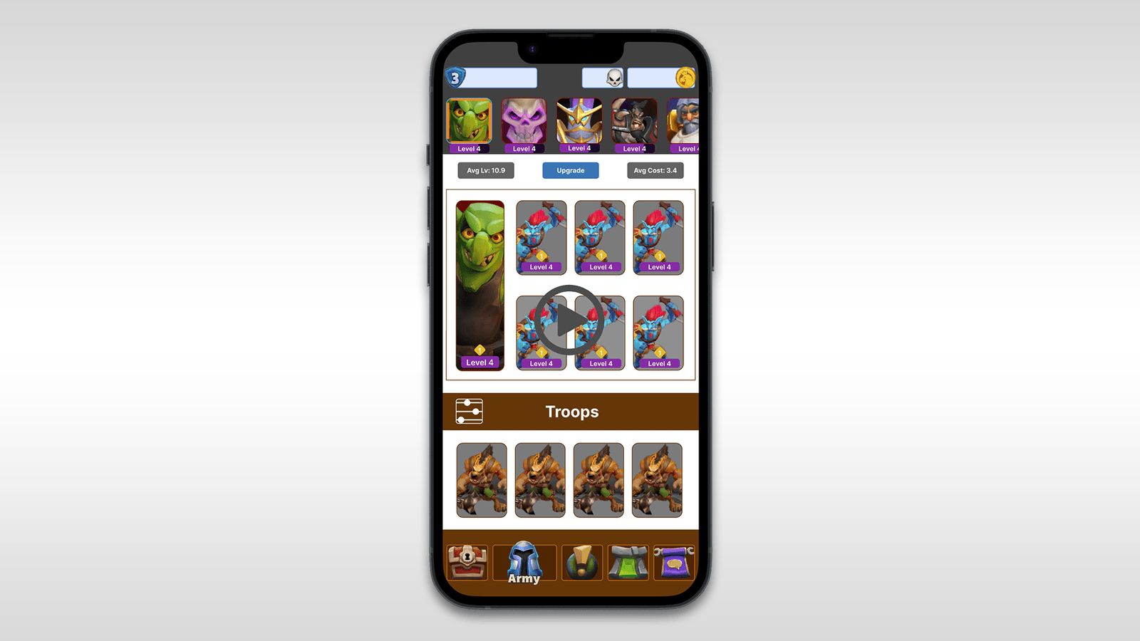
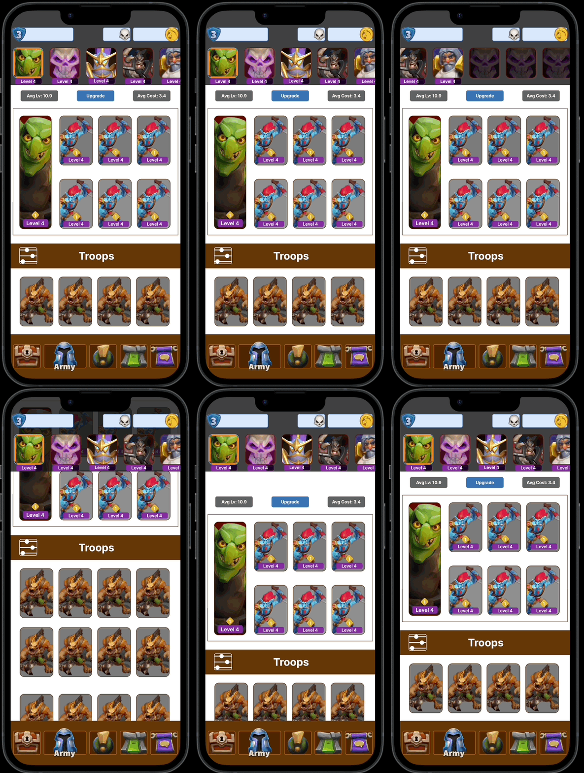
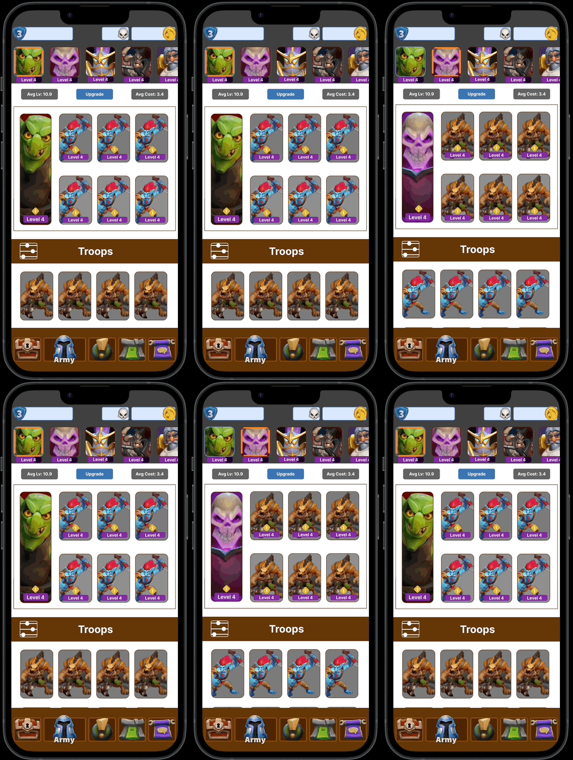
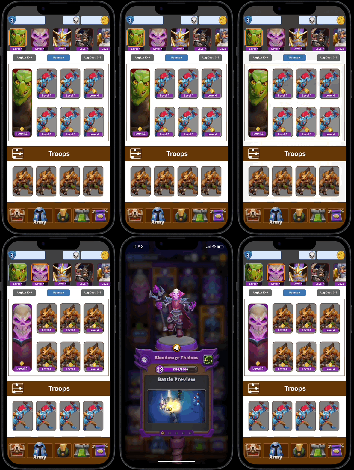
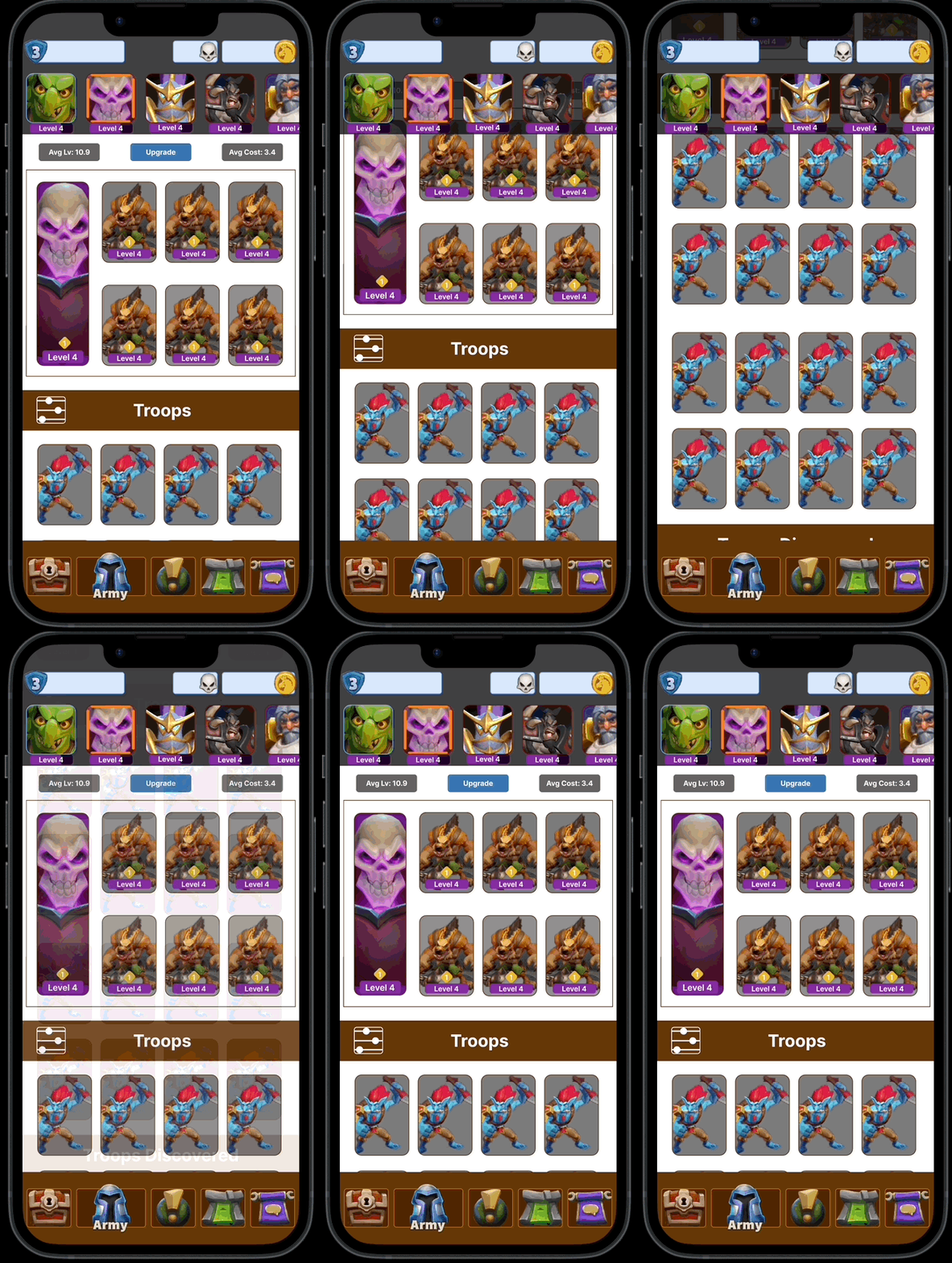
Production-ready screens
Measured outcomes
The initiative led to a comprehensive UX redesign that resulted in a 40% increase in player retention on the feature through simplification of the user flow. Thorough research, prototyping, and testing culminated in a robust solution that significantly improved the overall usability of the Army Leader selection feature. The project team also undertook art exploration and optimized interface layouts for 100% scalability across both iOS and Android devices.
The enhanced visual hierarchy of Option 1 successfully established Leaders as a prominent, always-visible entry point - helping players quickly identify and access their available options without navigating away from the Army screen.